
Jefferson Vilela is a law firm specialized in public law, with emphasis on military law and consulting law for public entities. The target public is the military of all forces, as well as consulting for public entities such as Mayors and Municipal Secretaries.

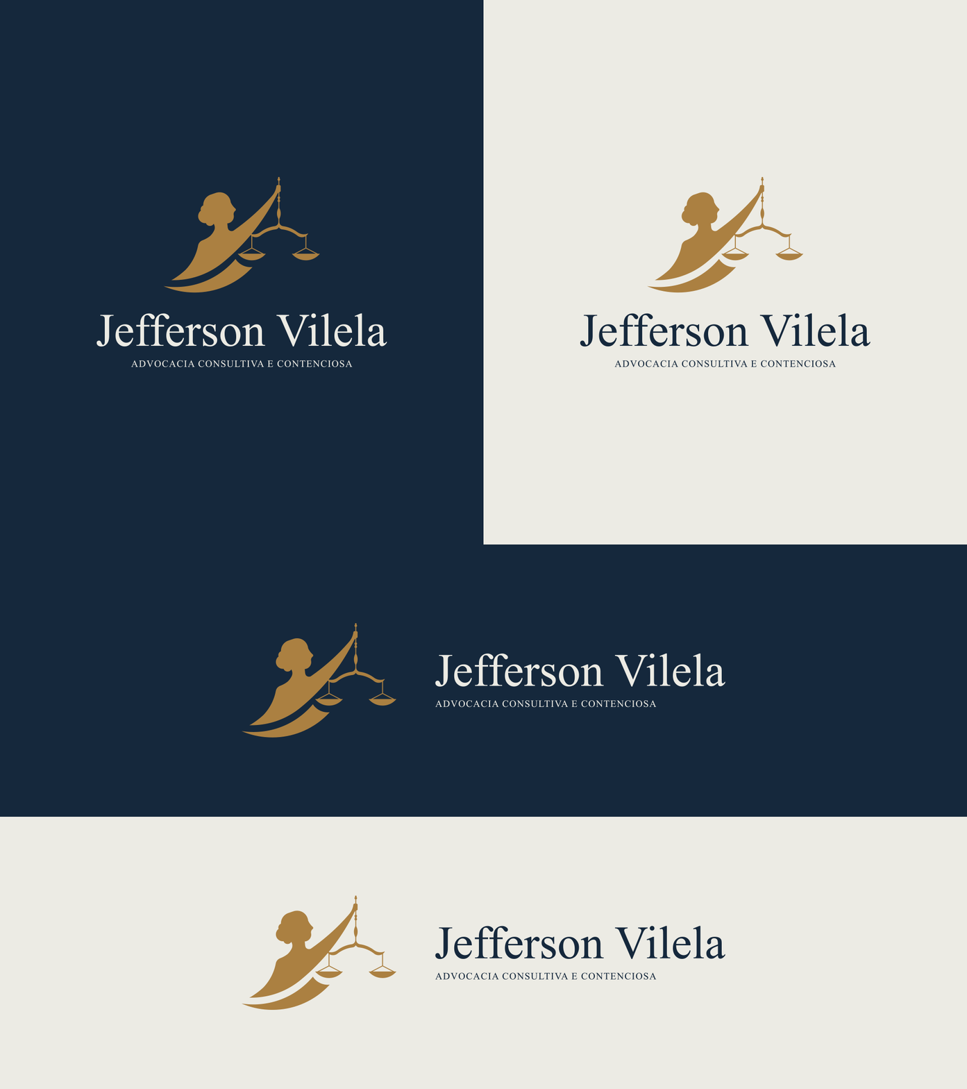
The client contacted me looking for a visual identity that would transmit seriousness and trust, but without abandoning modernity and joviality. Due to the client's personal taste, it was decided not to use a monogram as a symbol. With this in mind, we used Lady Justice as the concept for the symbol design. She symbolizes the fair and equal administration of the law.

As stated earlier, Lady Justice was the concept chosen for the symbol, which resulted in a minimalistic and striking symbol. A serif typography was chosen for the logo. The symbol and typography complement each other very well and convey confidence and seriousness to the logo.
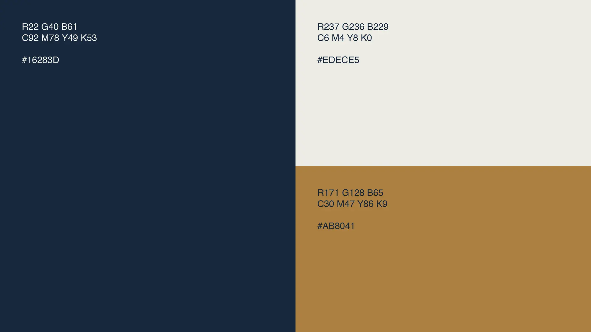
Last but not least, the color palette was developed to complement the visual identity. Dark blue, dark beige, and light beige resulted in a serious, versatile color palette capable of providing a great contrast between the symbol and the typography.





Schedule a meeting right now and tell us about your company, challenges, and goals, and find out how our approach can boost your business growth.